St. Ives Rebrand
Cosmetics + Skincare
art direction// packaging design // branding + identity // marketing collateral
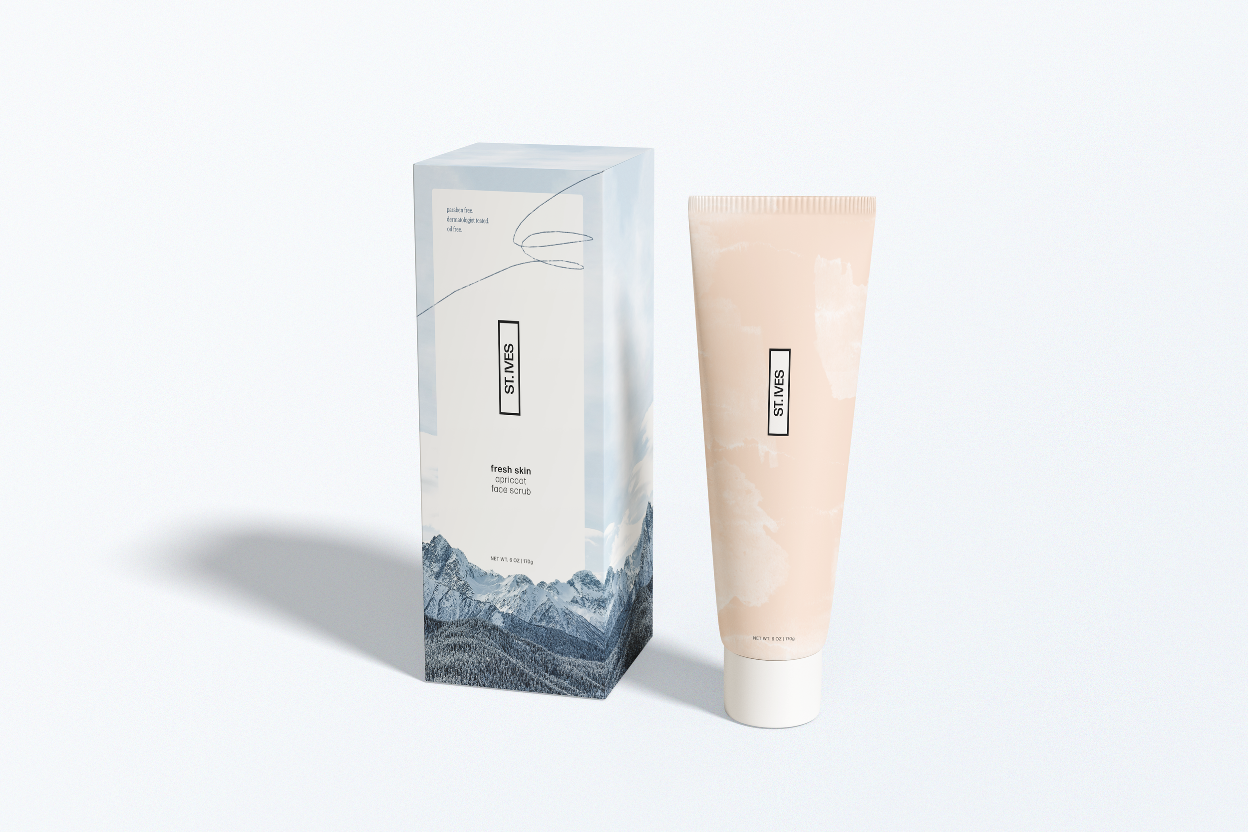
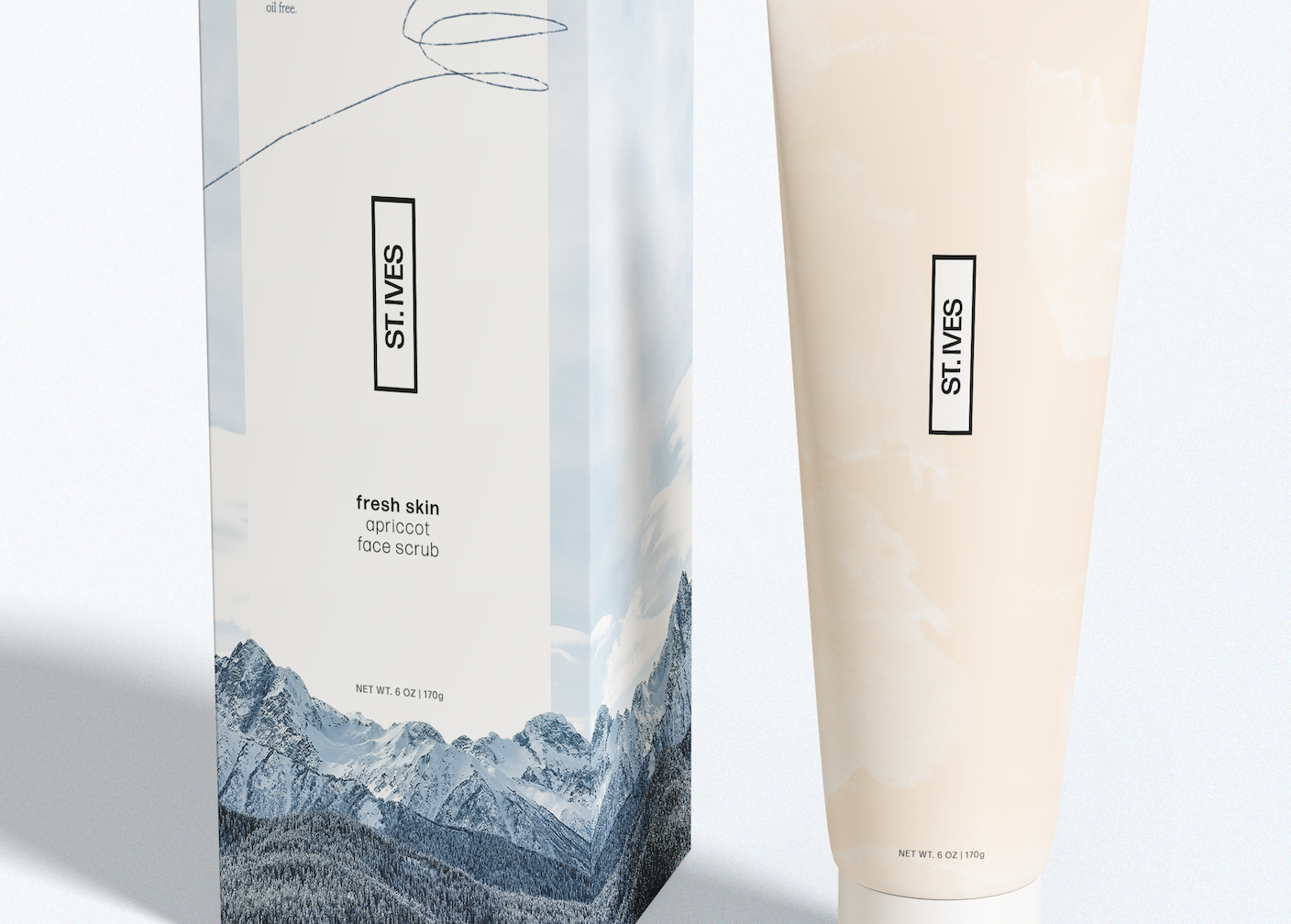
St. Ive's, the popular drugstore skin and body care brand, is well known for it's cruelty-free, 100% natural products and signature colorful packaging. As a passion project, I chose to fully rebrand St. Ive’s Into a more exclusive, luxury brand – developing a new logo, simplifying the image-heavy packaging, and reducing the extensive product line to focus solely on the apricot-centered lotion, exfoliator and face wash.
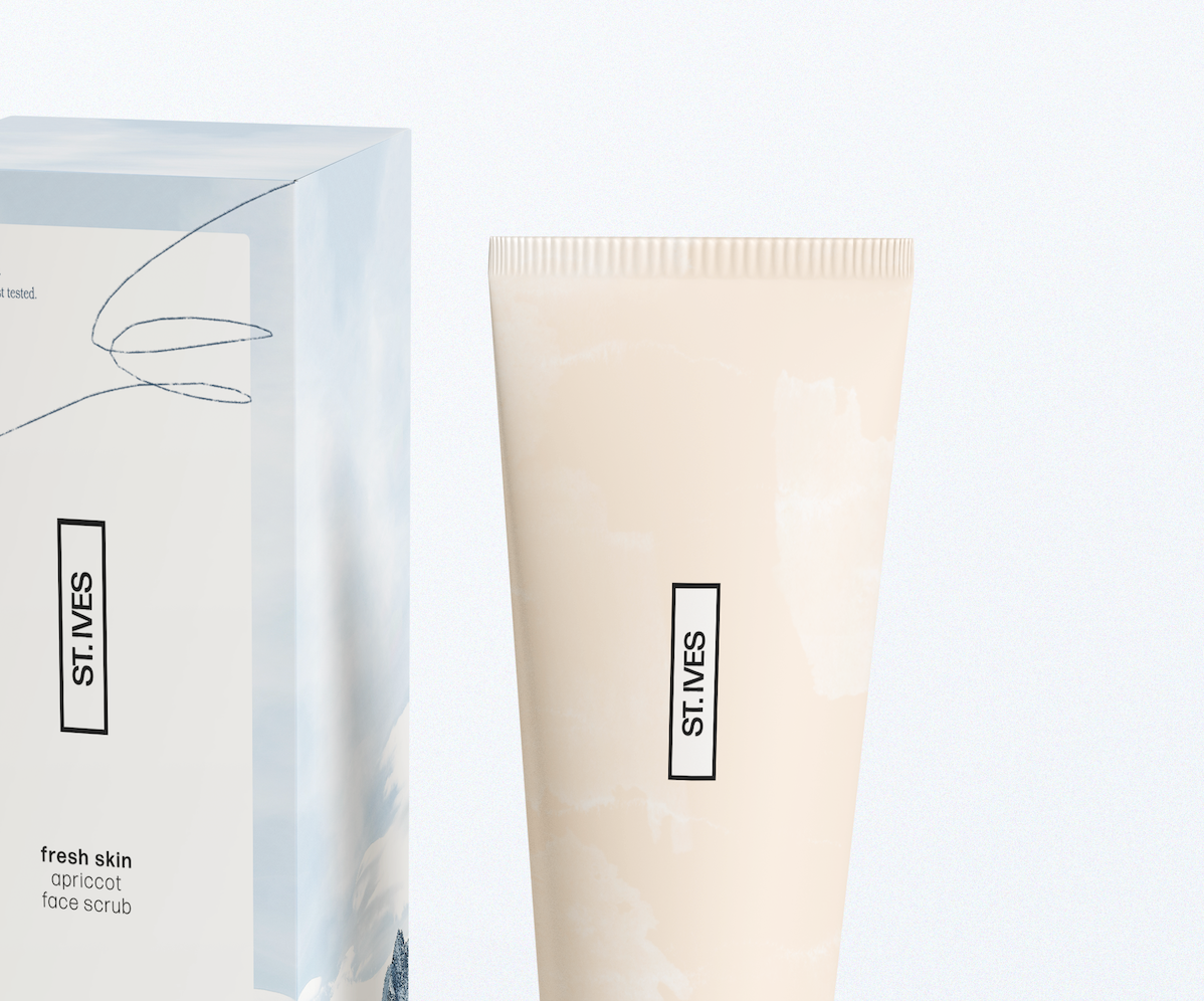
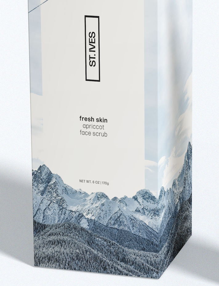
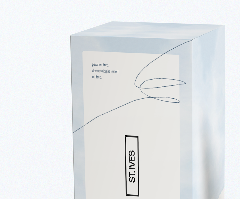
As these products were created for both men and women of all ages, I wanted the branding to feel simple and timeless. In its current state, the St. Ive's logo Is dominated by a mountain graphic, swooping serif font and a green leaf for an apostrophe. To reflect a more high-end look, I modified the logo to a basic sans serif, with a small black border allowing the logotype to serve as a minimalistic, yet Identifiable stamp that can be placed on both primary and secondary packaging with ease.

Current Primary Packaging Design
Updated Primary and Secondary Packaging Design
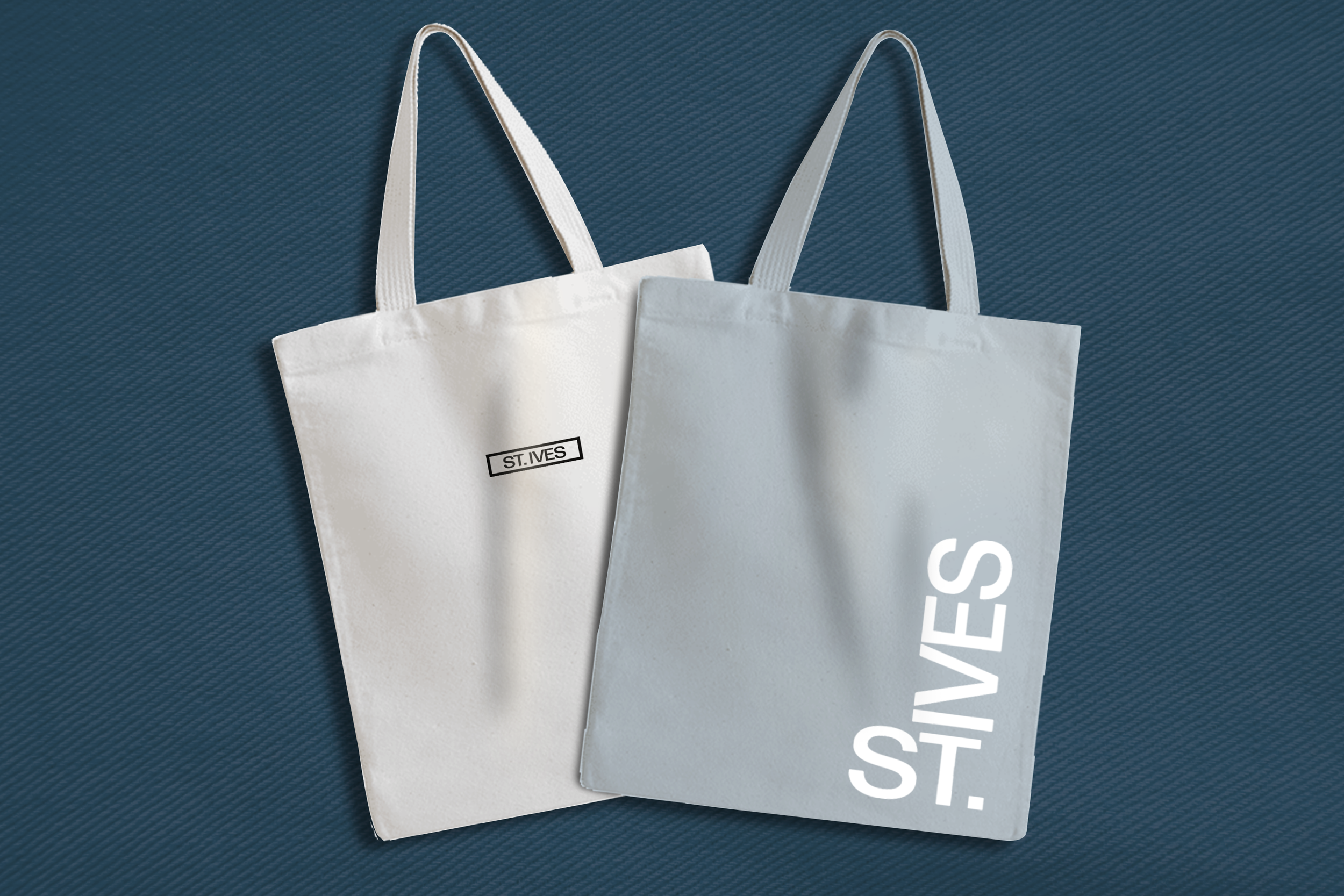
In addition to redesigned packaging, I created a shipper box, which would house products bought by. customers online, and also developed a tote bag with the new logo. As many luxury skincare brands have expanded Into wearable goods, I wanted to do the same for St. Ive's

